A performance tool that could not show performance numbers
Administrators were filing performance tickets while the product told them they were healthy. I designed the fix, under a constraint that removed the obvious solution.
- 186active instances a month, from a baseline near 130
- 24recommendation types, one shared model
- 3surfaces owned: optimization, performance, security
The score was answering a different question
I design Instance Health for Data Center: optimization, performance and security. Administrators had no unified view of how an instance was actually performing. To learn what was slow, which journeys were affected and what to fix first, they left the product for external monitoring tools.
The product already had an opinion. An Instance Optimization score reported health, and Performance Insights was expected to sit inside it as one combined story. Telemetry showed the score matched real user experience only 25 to 30 percent of the time. It was not broken. Optimization is preventive configuration: guardrails, sizing, data shapes. Performance is live user impact. Two honest measures of two different things.

Merging them would have implied a relationship the data did not support. An administrator could read a healthy optimization score while their users waited, which turns one number into vanity and makes the other look unreliable. Two recommendation lists on one screen would also force a choice nobody had the information to make.
Optimization answers how to configure for success. Performance answers how people experience the instance right now.
I made the design and data case for separating them and took both directions to Data Center engineering leadership with the trade-offs rather than a single recommendation. Performance got its own tab inside Portfolio Insights. The placement decision was shared across product, engineering, design and leadership. The evidence and the argument were mine.
The obvious answer was off the table
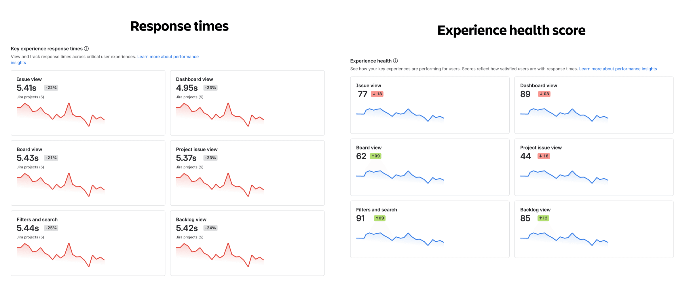
Raw response-time figures could not appear beside comparable cloud product information. Performance could be shown, but not as a number that invited comparison.
The first customer-facing design did exactly that. Key experiences reported as RFU, request initiation to full interactivity, in seconds, across 24 hour, 7 day and 30 day ranges. It reads clearly and it was the direction we had to leave behind.
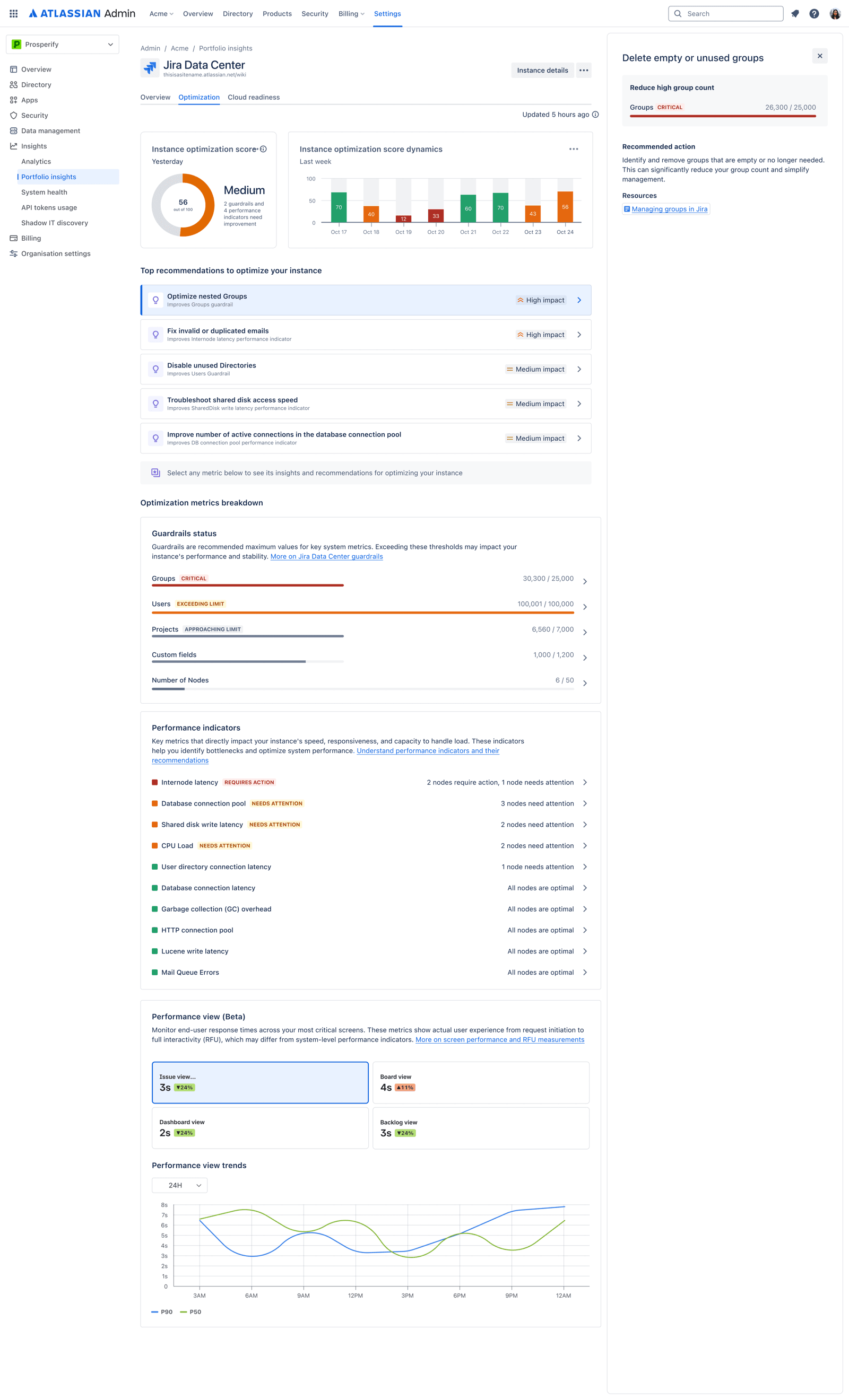
So the brief became: help administrators fix performance problems without showing them performance numbers.
Choosing a measure that stays honest at the extremes
Four options, judged against usefulness, severity visibility, actionability and comparison risk.
- Raw timeThe most direct. Violated the comparison constraint, and needed specialist knowledge to read.
- 0–1 scoreFamiliar, scannable, and silent when it matters. Already-slow requests can get far slower while the score sits pinned at its minimum.
- No viewRecommendations alone sidestepped the metric problem and removed the context that makes a recommendation mean anything.
- Experience healthApdex-based satisfaction across all requests. Status and trend, which journeys need attention, whether things are improving. No comparable figure.
An alternative that showed detections instead of actions
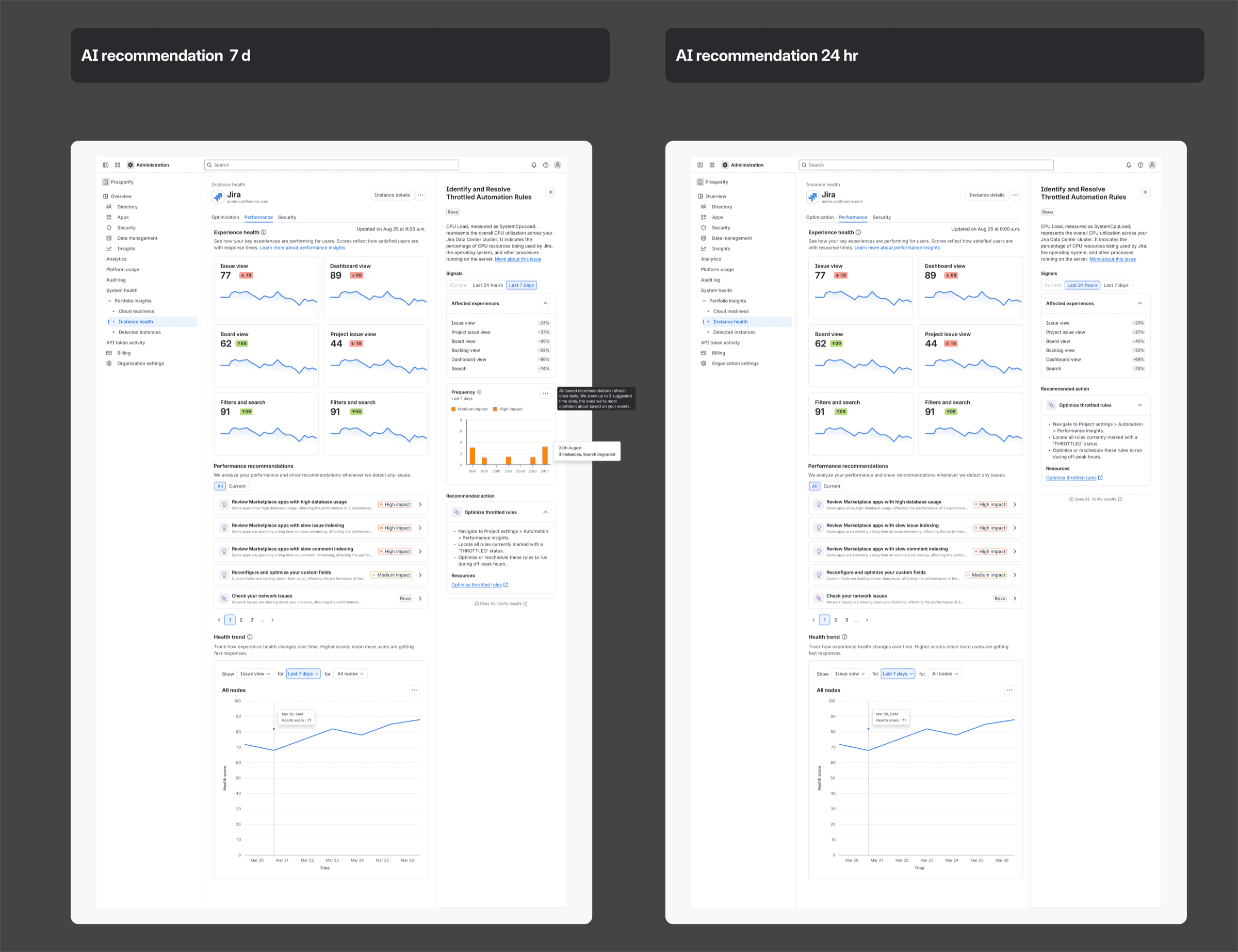
One direction framed the panel as insights rather than recommendations: high database usage from Marketplace apps, slow issue indexing, network issues detected. Naming what the system found rather than what to do about it.
It reads better the first time you see the interface, because it makes no claim it cannot support. It reads worse every time after, because an administrator holding a list of detections still has to work out the action, which is the job they came here to have help with. The shipped model names the action and keeps the evidence one level down.
Twenty-four kinds of signal, two products, one decision
Fourteen recommendation types in Jira, ten in Confluence, in no consistent shape. Each had its own parameters and merge rules. Signals arrived across current, 24 hour and 7 day windows. Some values summed, some kept the maximum, some needed lists of affected entities. The two products shared neither a signal set nor, in places, vocabulary for the same idea.
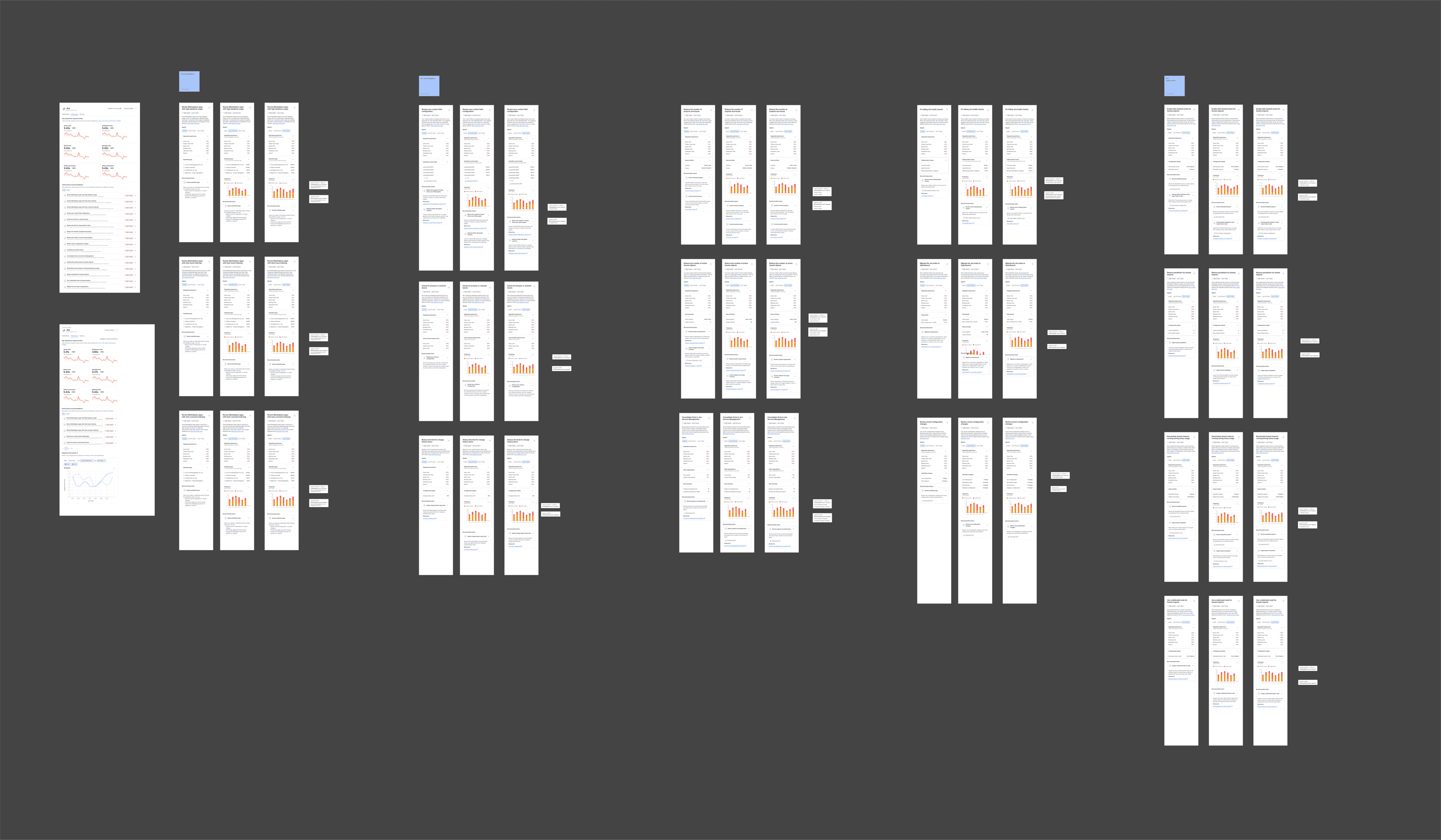
I read the engineering specifications for every type in both products, then ran a workshop with content design, engineering and product on one question: how do we organise this so the administrator understands the evidence and still owns the decision? The answer was to make the recommendation both the grouping mechanism and the unit of presentation, answering what happened, how significant it is, what evidence supports it, and what to do next.
Time windows were the system's problem, not the administrator's
The first model filtered the whole page by a time range. A serious recommendation could sit behind a window nobody selected, and the interface organised itself around how the data was collected rather than how a production issue gets triaged.

What went out
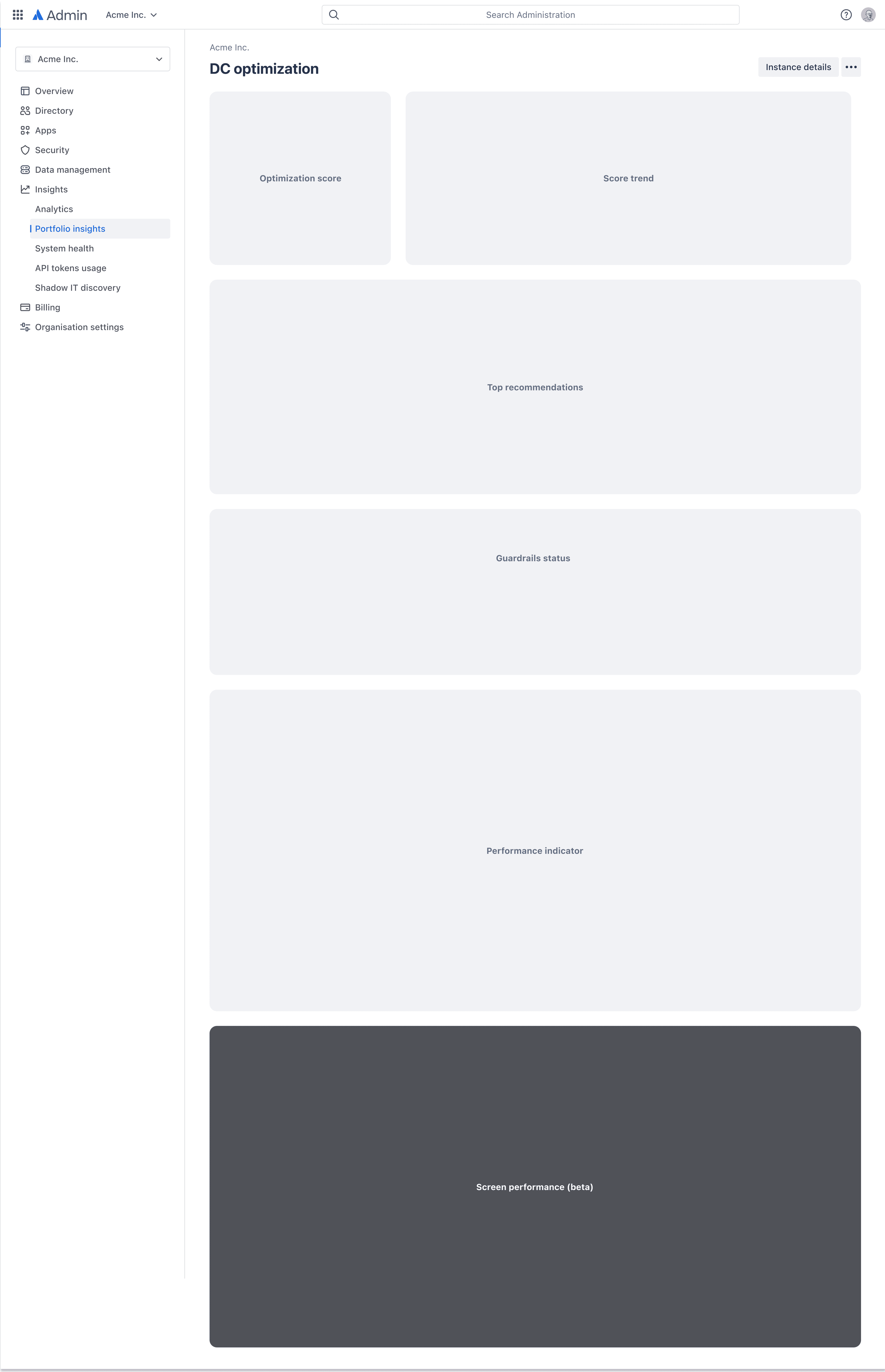
A dedicated Performance tab inside Portfolio Insights: experience health and trend for key journeys, grouped and prioritised recommendations, the All and Current switcher, recommendation detail with signals, degraded experiences and identified apps, and no raw response-time figures.
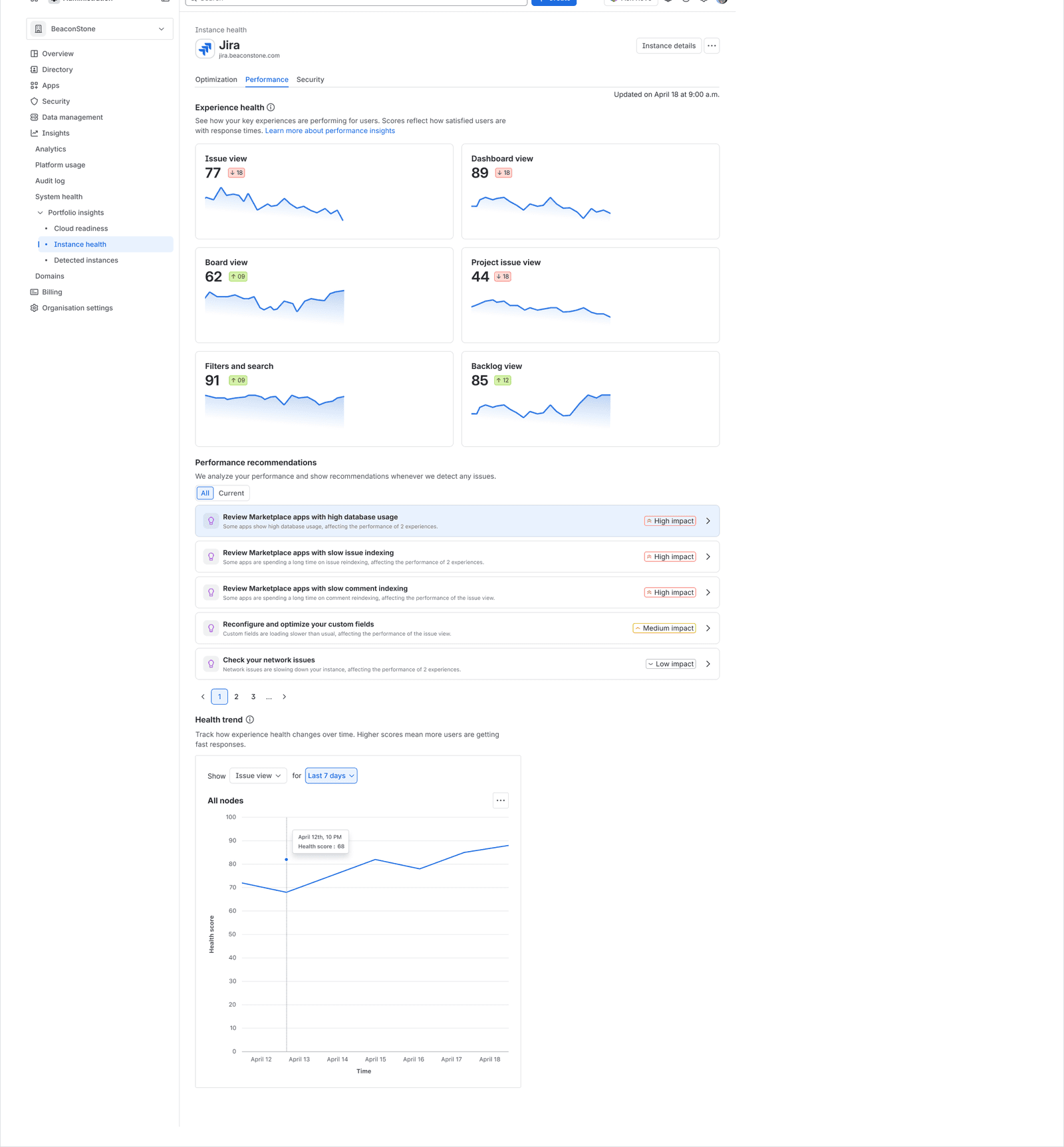
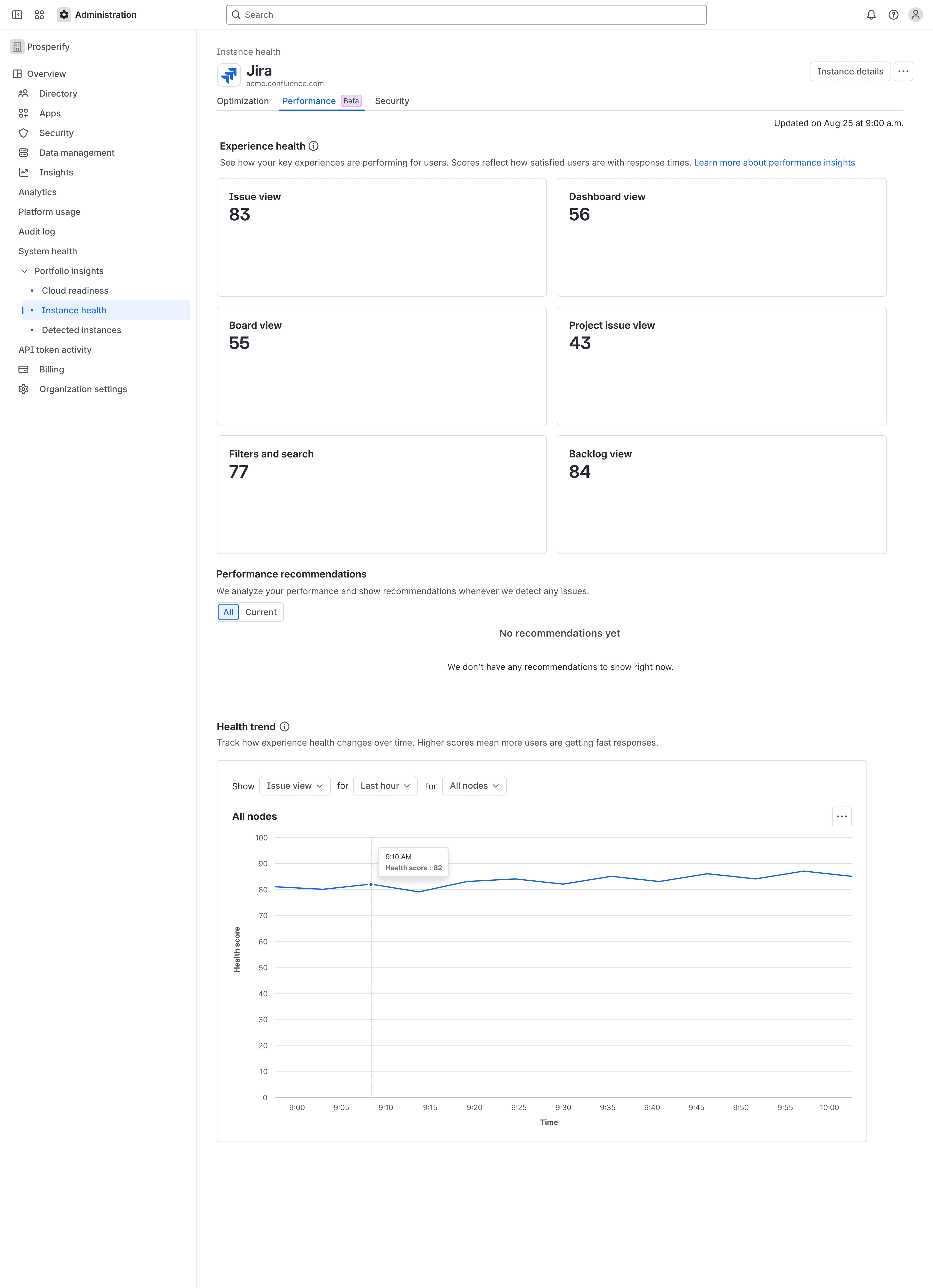
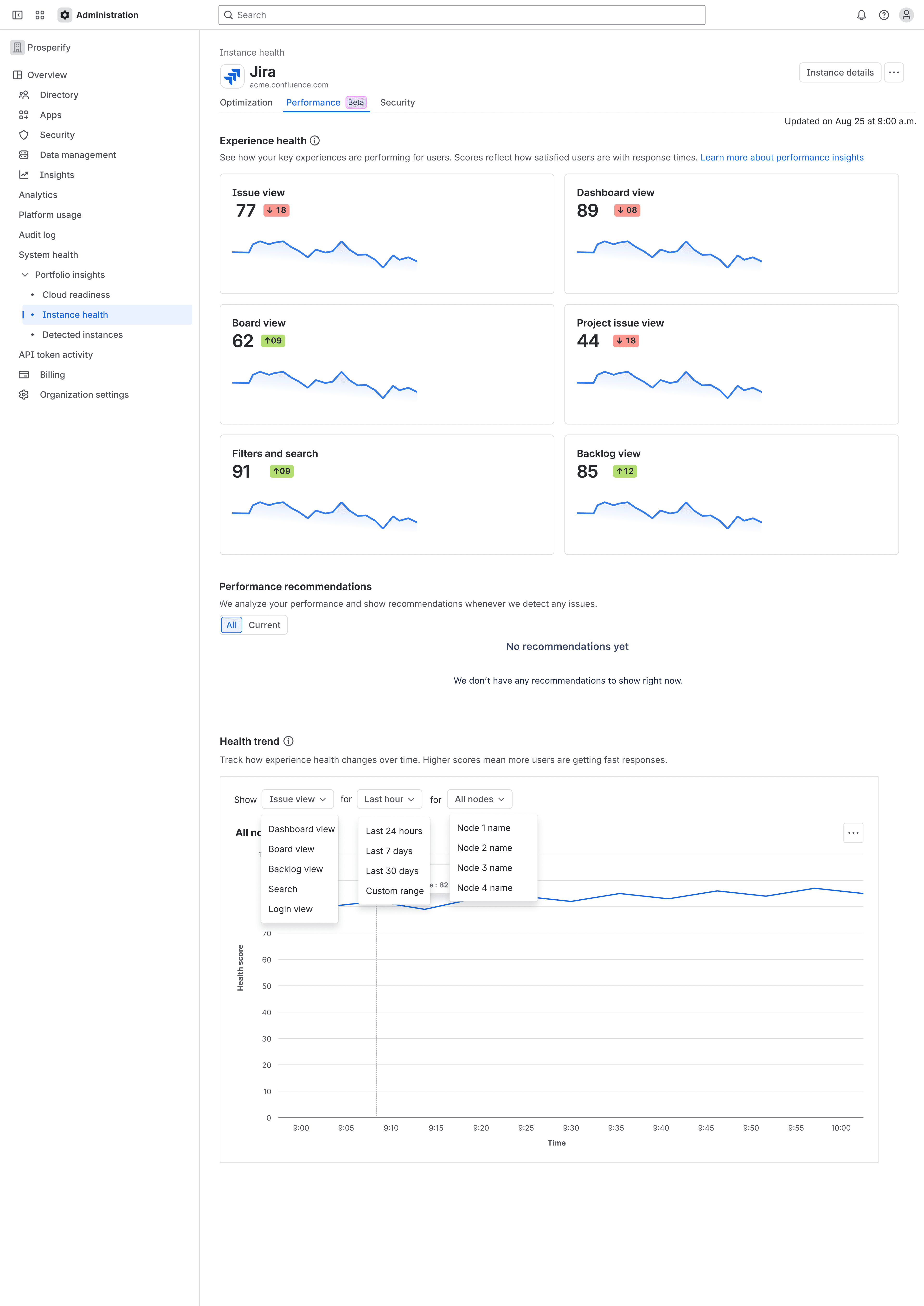
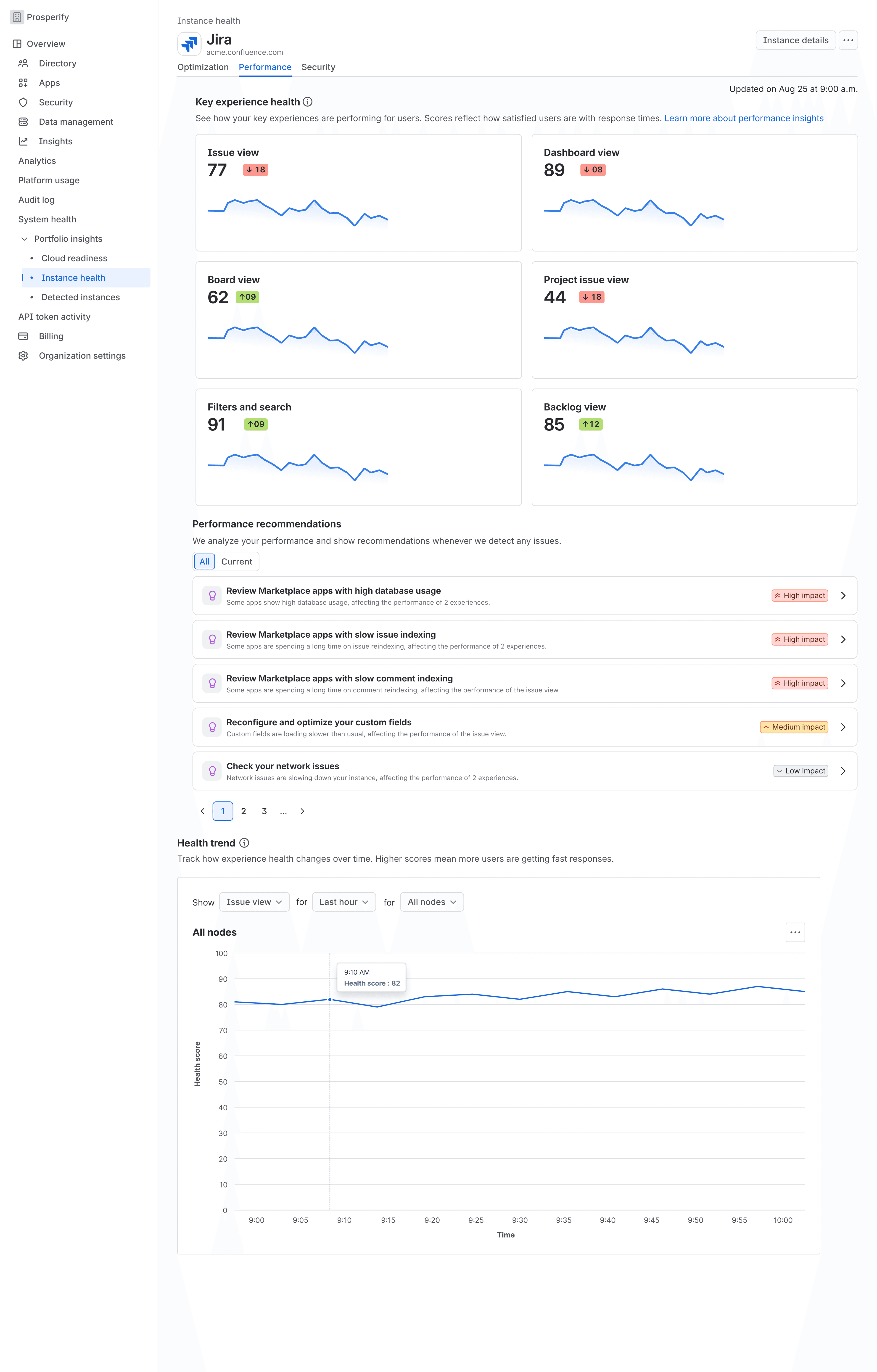
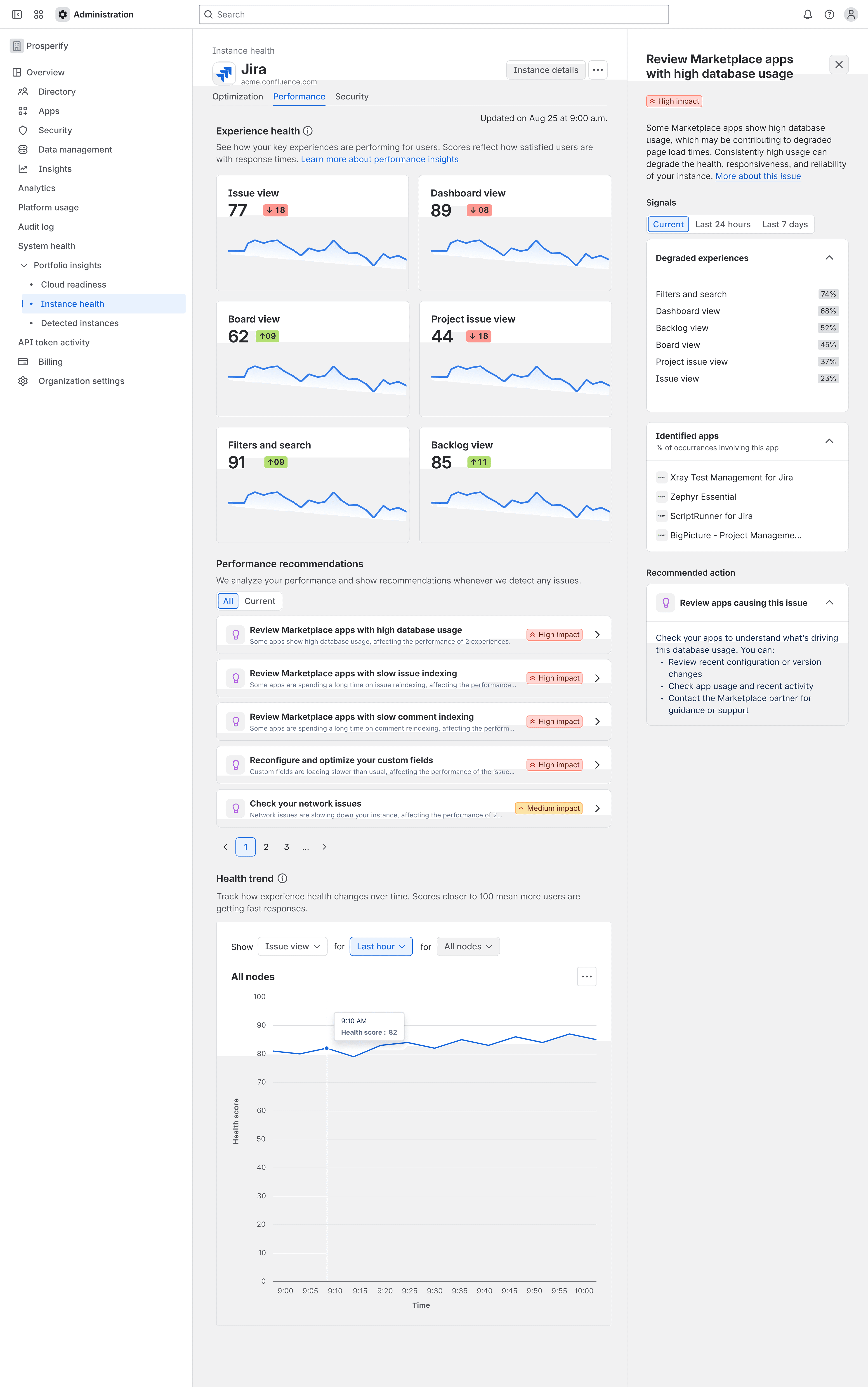
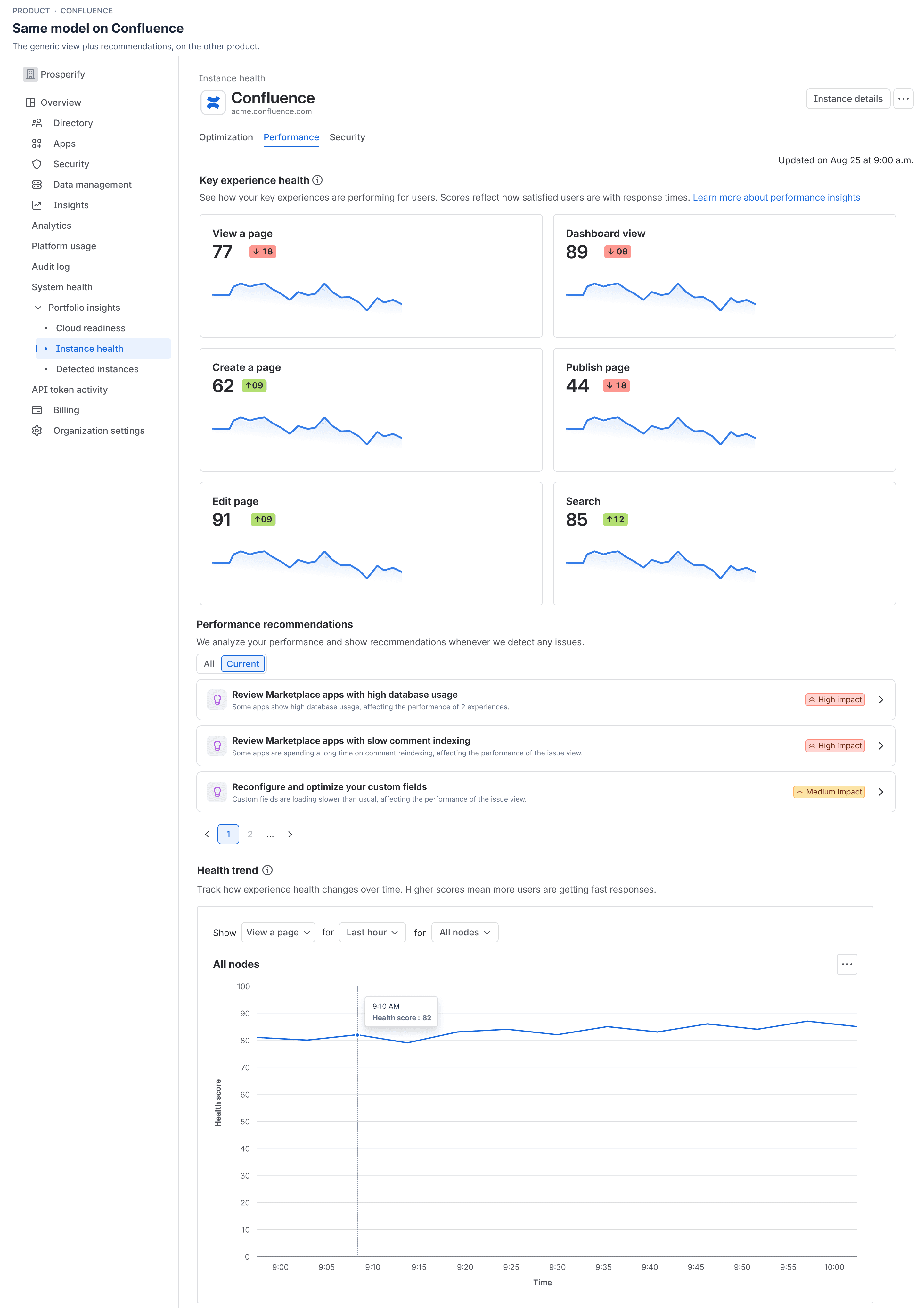
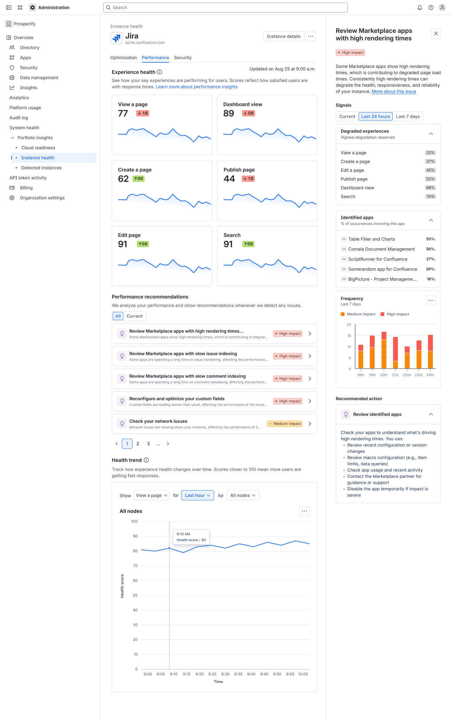
The same model runs on Confluence with its own signals. An administrator running both does not learn two mental models for one job, so the card structure, priority logic and evidence hierarchy are shared. Only the signals differ.
Adoption has grown from a baseline near 130 at roughly 100 to 130 a month, reaching 265 active instances and 186 in the current month.
Product outcomes, not design alone.
What I would test
Where similar-instance guidance belongs when there is no active regression. Some recommendations come from comparison with instances of similar scale rather than an observed problem, grouped by user count, group count and node count. Useful when an instance has too little history of its own, and easy to mistake for a live incident.
The first version keeps it in the broader set and stops it outranking observed problems, but I do not know how administrators read it. That needs a moderated study on a shipped surface, and it is the gap here.
We also explored an AI model for higher-fidelity diagnosis. An on-demand version gave control and created unbounded cost. I helped shape the alternative: generation fires only on a detected regression, at most once a day per instance, tied to the event that triggered it. It has not shipped.